Friday, April 27

Visual Blogging: Storytelling & Interactivity


My vision for the future of media? Within seven years, the world will be interacting with… itself!

I believe the world of seven years from now will be full of interaction and storytelling since humankind is predisposed to communication… visual communication, more so than verbal communication.

Constantly evolving… cross-cultural, cross-lingual, cross-belief… global communications that will be based in the visual realm and tremendously more colorful because of the number of people contributing their opinions, their life experiences… their stories.

Media will still include print and electronic elements. It’s just that where they begin and end will be very “grey”. Not exactly merging… more like morphing from one to the other.

For example, newspapers… I see them being quite personalized. I’ll probably log on to the internet in the evening, select the general categories of the paper I want to read/hear in the morning, and then either print out my paper or download a .pdf to read on the way to work (if I ride the train)… or have my car read to me (if I’m driving somewhere).

“All at once a palace of peace will fill my eyes — how nice!”, Yusuf croons. And I start thinking about the content of news photos. It will probably take seven years for the world to go through its current cycle of war. Not that I want it to take that long…. I’d hope to finally see photos of some radical group finally laying down their arms… embracing peace… (I can dream like Yusuf, right?)

There are almost 200 words in Yusuf Islam’s lyrics. I’ve now added just over 300 more with this post. Somehow, 500 words seem very inadequate for a weighty subject like the future of the media.

But then… it’s mostly about the visuals, right?

Somehow in seven years time, I think I’ll still be “waiting for that moment to arrive.”

Friday, April 20

Visual Blogging: Twin Cities News – Persona #1


Jonathon could be a significant influence on a site redesign due to his interest in the classified advertising categories of real estate and recruitment.

Visual Blogging: Twin Cities News – Persona #2


Elena could be a significant influence on a site redesign due to her reading interests in the classified advertising categories of real estate and recruitment.
75 percent of the [newspapers] sites' revenues come from 'upsells' of the traditional 'Big Three' printed classified advertising categories of real estate, automotive, and recruitment.
http://smallinitiatives.com/2006/04/26/publish-til-the-cows-come-home-then-what/

Wednesday, April 18

Visual Blogging: Smooth Sailing thru a 4-Hour Art Tour

After scanning many museum sites this week... from quilt and fiber arts museums housed in a barn (www.wiquiltmuseum.com) to the delicate/delightful/dainty Jello-dessert Museum (www.jellomuseum.com), I finally landed on www.thewalters.org. Yep, another art museum... hmmm, are we beginning to see a pattern forming in this class assignment's "best" examples of interactive Web pages?

Task Scenario:
Planning a Visit to The Walters Art Museum in Baltimore, Maryland
Me, my mom (75 years old; with bad knees; sweet old lady, with a great sense of humor and an interest in anything that her grandson is interested in) and my 15-year-old (energetic and mercurial) son, Josh, are planning to visit Baltimore and go to The Walters Art Museum for a 4-hour visit.

Planning ahead for any and all disasters beforehand... I visited the museum’s Web site at www.thewalters.org.

The museum's site was simply and cleanly organized with top nav bar categories of The Museum, Works of Art, Exhibitions, Plan A Visit, Programs, and Education. It was pretty easy for me to check out the following potential disasters/concerns:
1. The parking situation – a simple click on Plan A Visit brought up a left nav bar which had "Directions and Parking" as one of the topics. I had to scroll down past the directions, but soon found the parking details: A staffed parking lot is conveniently located across the street from the museum at Centre and Cathedral streets. Museum visitors are eligible for reduced rates so stop by the Visitor Information Desk to get your ticket stamped...Other nearby parking lots include the Peabody Garage at Centre and St. Paul streets, the Franklin Street Garage on West Franklin Street between Charles and Cathedral, and an open lot between West Franklin Street and Centre Street near Park Avenue. The Peabody Court Hotel at the corner of Cathedral and Monument streets offers valet parking. Metered parking is also available in the neighborhood. to make things even clearer, the included this map with the parking clearly marked!

2. Can I get Mom a wheelchair? – OK, time to try out their search function... I just typed in "wheelchair" and two links appeared. The first, FAQs, told me in the first paragraph that the museum was fully accessible by wheelchairs and that a limited number of wheelchairs are available for free at the Visitor Information Desk on a first-come, first-served basis. Note to self: snag one sooner than later!
3. Is there a contemporary or bleeding edge exhibit that will win cool points in Josh' eyes - and how would you know if it is cool enough? – Hmmm... I first clicked on Programs and then tried Education. The second category had a section called "Interactive Design", so I took a chance... Integrating the Arts: Mummies, Manuscripts & Madonnas... Hmmm...I think this would actually keep Josh occupied and isn't anything that has to do with mummies "cool"?
4. A restaurant/food option that fits the bill? Price? – Back to Plan A Visit and the side nav link to "Amenities". A-ha! The Museum CafĂ© features a variety of sandwiches, salads, hot and cold beverages, and desserts in a self-serve casual setting adjacent to the museum entrance. No discussion of price, so I then clicked on the link for a list of neighborhood restaurants with membership benefits. Some of the restaurants even have links to their Web sites! Hmmm...the Akbar sounds interesting... and the prices are right on their menu. Indian food is always an adventure for my gang!
5. Tour guides/Audio tours – Back to Plan A Visit and the side nav link to "Tours": Museum-trained volunteers provide tours that are suitable to a variety of visitors, including adults, families, and the K-12 school visitors. "Walk-in Tours"
are free docent-led tours of the permanent collection or the special exhibition and are offered Saturdays at 11:30 a.m. & Sundays at 2 p.m. No reservations are required. Meet in the Centre Street Visitor Lobby. Free audio tours can be signed out at the Visitor Services Desk for use in the permanent collection.
6. What else is close by? – While I'm pretty sure we'll be very busy for more than the alloted four hours, I zipped back to the Plan A Visit link and the side nav link to "Baltimore Area Links". No problemo! There's enough to keep us going for the rest of the year!
7. Special events or performances? – Again, back to the Plan A Visit link and the side nav link to "Visitor Information". Another link to "View Events Calendar" brought up the programming bonanza! Looks like Monday and Tuesday are the lightest programming days... with more programs offered later in the week.

Interactive... Let Me Count the Ways...
1. The Museum Director, Gary Vikan, has his own blog
2. There's a link on the splash page that takes you to "Listen Online" opportunities at 88.1 WYPR radio's Web site where they've archived Director Gary Vikan's Monday morning broadcasts, "Postcards from the Walters", that explore the cultural and historical treasures of the museum.
3. Interactive Exhibits at the Museum, like Integrating the Arts: Mummies, Manuscripts & Madonnas

For all the reasons/information above, I believe The Walters Art Museum is one of the best examples of web site interaction design that I could find. My emotional response in using the web site was one of pending excitement. Similar to the feeling that there's "something exciting right around the corner", with each click of my mouse... I received more good information and became more excited about our upcoming visit.

Friday, April 13

Visual Blogging: Interactive Nightmare - Improved?

From 4/9/07 Blackboard Class Discussion posting:
Here's one from Milwaukee that right up the yawn hierarchy from the museum of brands, packaging and advertising:
http://www.eisnermuseum.org

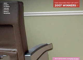
The site relies too heavily on a picture of its sparse interior. Wha-hoo! Now, I hope no one get too excited from that snapshot. (I'm pretty sure that's the wall divider that's directly across from the reception desk.) The concept of the museum is novel and more power to Mr. Eisner's family and friends for supporting it.

However, their Web site is pretty telling with regards to what a visit to the museum might entail. Just like the site... interactivity is TOTALLY lacking!!! I guess I'm a "hands on" visitor and if there aren't any tires for me to kick, then I'd really like to watch some sort of visual gymnastics.

4/13/07... Whoa! Did someone at The Eisner see my blog?
They've updated the photo on their splash page.

But, before anyone gets excited...
I decided to refresh my browser window...

and I refreshed it again...

...and again...

Unbelievable! I thought I was the only ya-hoo in Wisconsin that can't create slideshows (sad attempt to sucker Lars into helping me with my quilt slideshow).
Now, this may be because of my choice of browser (Safari), but it seems like they would rather let their repeat visitors think they're updating their site.

Sigh! This site is so dry it cracks when I look at it.
And, this is really so very sad because The Eisner has one awesome street address!
They're right in the middle of Milwaukee's Third Ward... THE spot for graphic designers, ad agencies, art galleries and antiques!